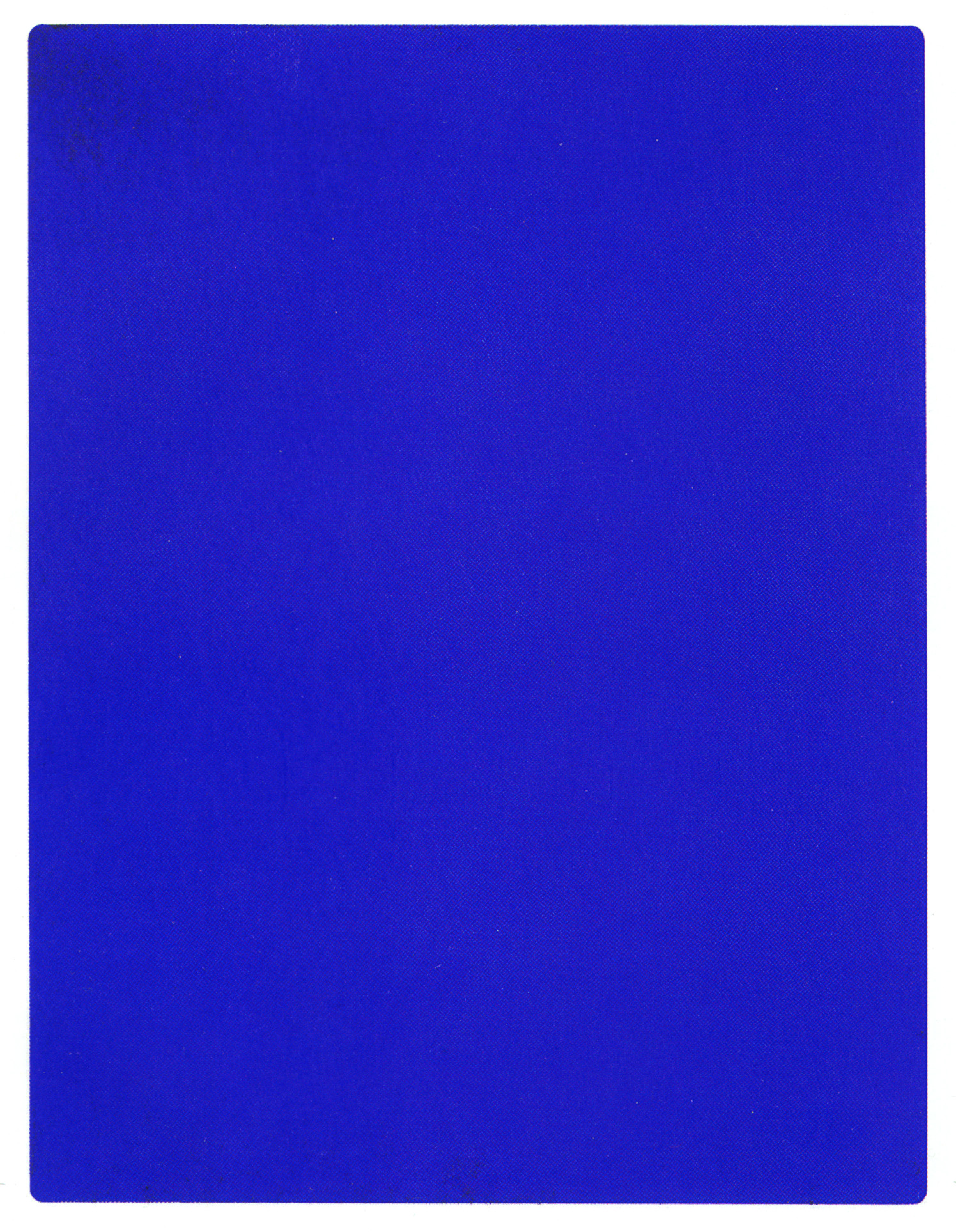
Yves Klein. For those, who are well versed in contemporary art, this name is likely to immediately bring to mind an intensely blue color. The IKB hue – abbreviated from ‘International Klein Blue’ – is a phenomenon unmatched in the history of art, where an artist teamed up with a chemist to develop a unique paint. The dye was mixed not with oil, which is the most common way of proceeding, but with a resin solution instead. This is what made it retain its strong, shimmering look even after many years. It was this color, that went to become Yves Klein’s trademark.
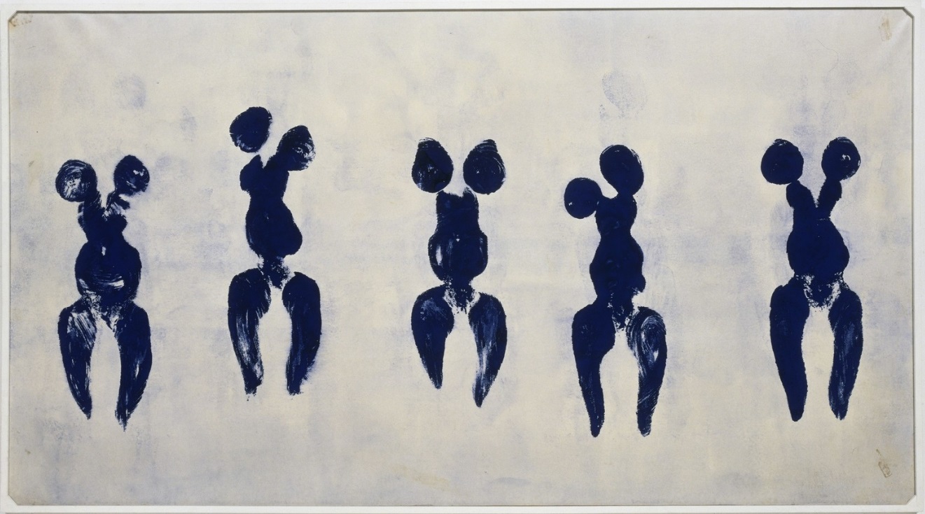
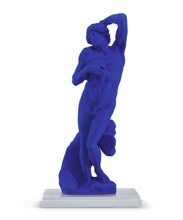
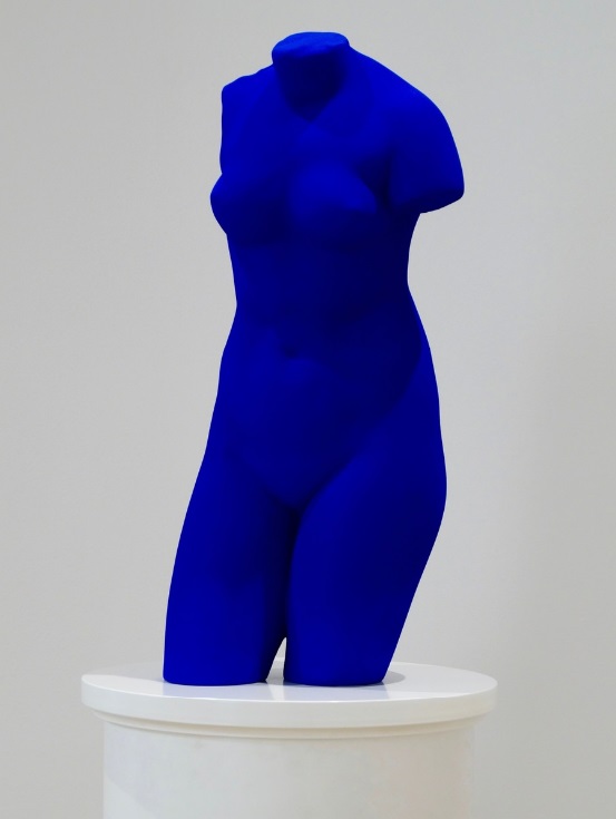
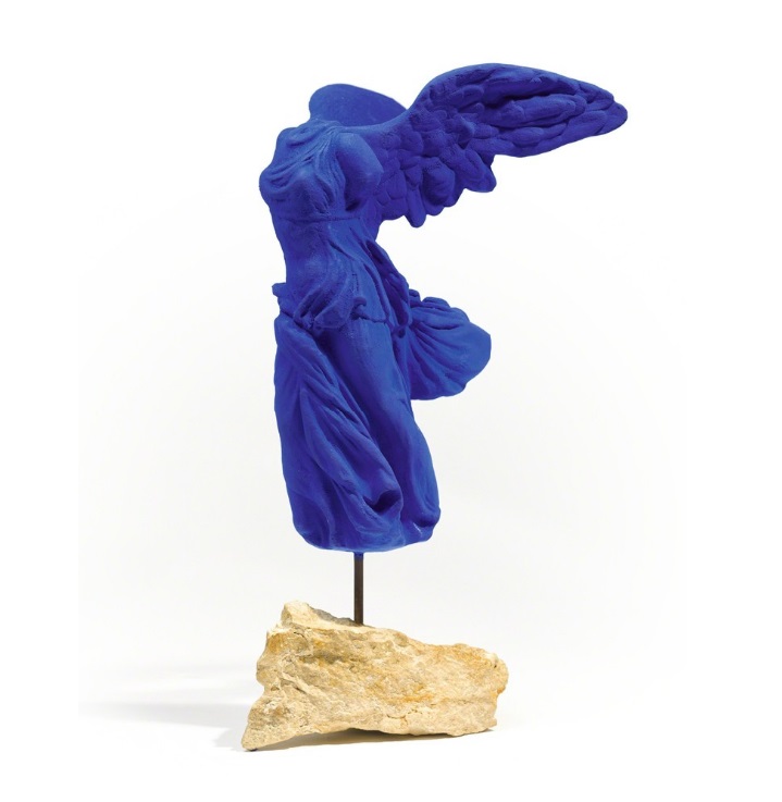
The artist would use it not only to cover paintings and fabrics to be later attached to plates, but he also painted blue sculptures, most often plaster copies of ancient or antiquating monuments: the Venus de Milo, the Nike of Samothrace or Michelangelo’s The Dying Slave, as well as the bodies of models, who would be asked during his performances to lay on canvases and become, as Klein called it , “living brushes”.
Especially noteworthy is how Klein used this color. What he would do is apply it with a thick layer, which created a uniform surface, devoid of any chiaroscuro or clearances. When you look at digital reproductions of his blue-series paintings, without being familiar with his works, you may get the impression, that the website has an error and the photo hasn’t loaded properly, that’s why you see a perfectly uniform blue square or rectangle on your screen.
But before Yves Klein arrived at his IKB hue, he was known for exhibiting monochrome paintings in other colors: pink, yellow or red. And although those one-color canvases were received rather indifferently by viewers and critics alike, the artist continued to pursue his artistic vision regardless. For Klein, canvases covered with one shade of paint were seen as an “open window to freedom, as the possibility of being immersed in the immeasurable existence of color”.
Many of you may be thinking right now: sure, what he says sounds nice, but it doesn’t really explain anything in terms of what it’s all about. To avoid getting lost in philosophical interpretations and highbrow language, let’s focus on the fact, that colors tend to evoke specific emotions. In some people, IKB will not evoke any feelings at all, in others it will bring back memories of an object in this color, while some others will simply be intrigued without knowing exactly why.
Long story short, everyone will respond differently to the same thing, as in the case of watching a still life, landscape or portrait. But when you think about it, such a monochrome artwork is also more liberating – both for the artist to express himself, and for the viewer to interpret that – precisely because the essence of the work comes down to a color and that alone can mean literally anything. Just deep-dive into your own mind and pick out whatever works best for you!
transl. Jakub Majchrzak
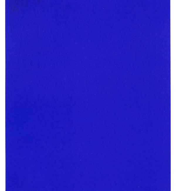 IKB 191, 1962
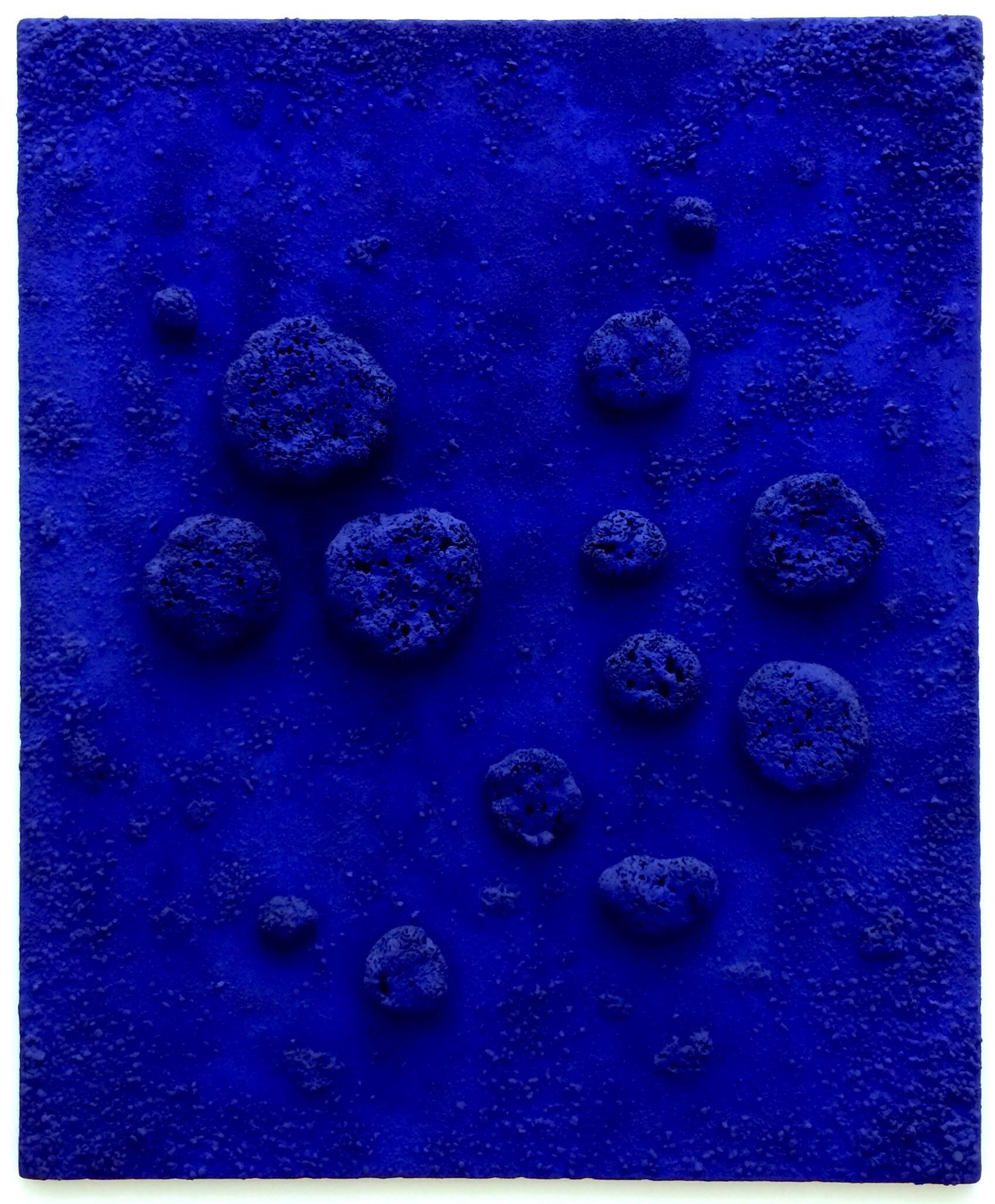
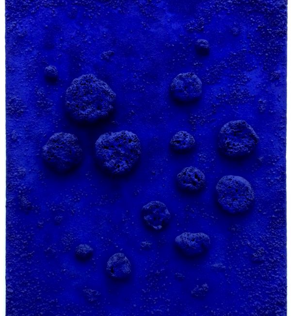 L'accord bleu (RE 10), 1960
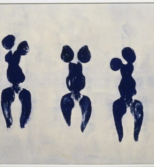 Anthropometry of the Blue Period (ANT 82), 1960
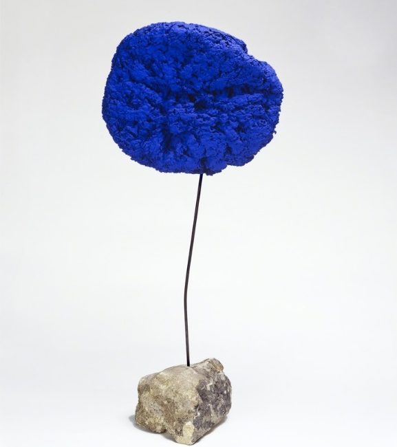 Éponge [SE180], 1957
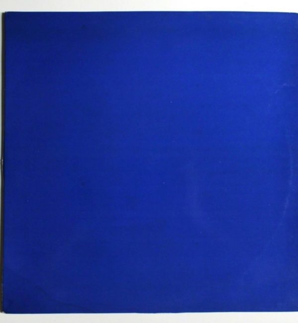 La Conférence à la Sorbonne, 3 Juin, 1959
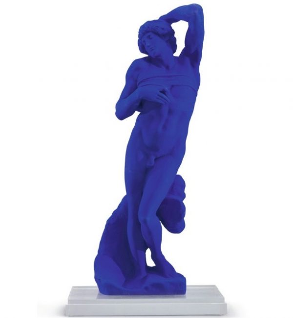 L'Esclave Mourant d'Après Michel Ange (S 20)
 Masque, (S 10), 1962
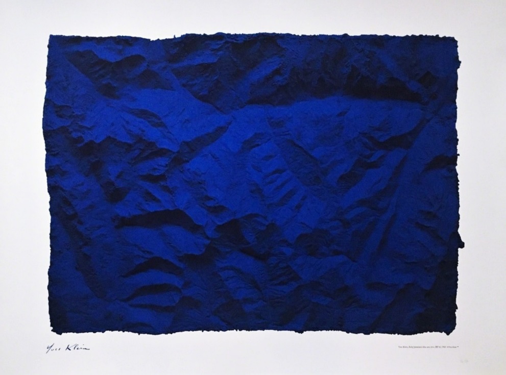
 RP7 - La Terre Bleue, 1957-88
 Table Bleu KleinTM, 1961
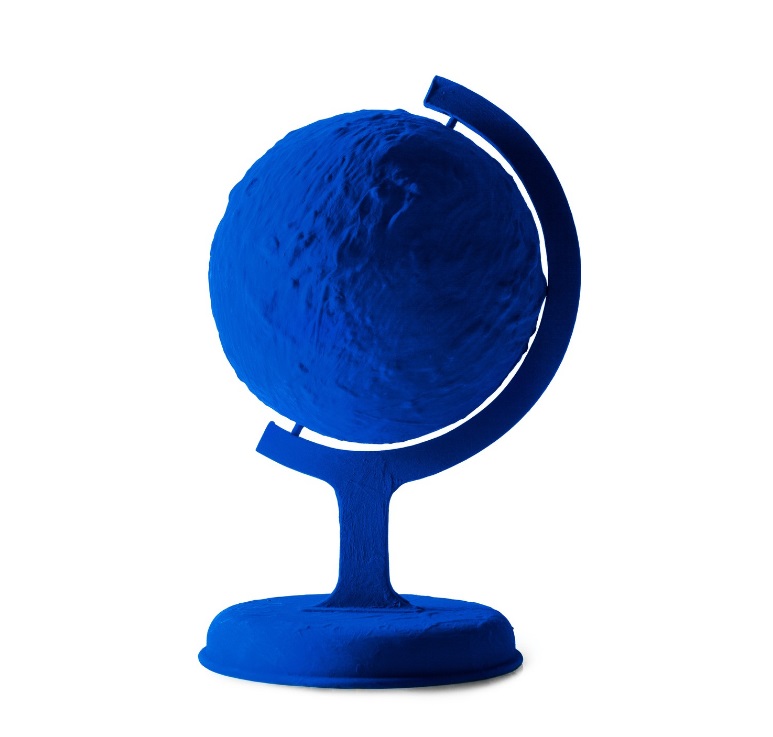
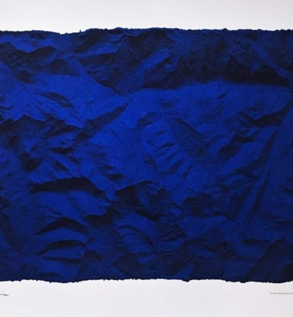 Untitled Blue Planetary Relief (RP6), 1961
 Venus Bleue (S41), 1962/1982
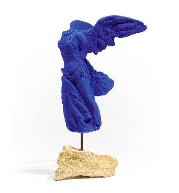 Victoire de Samothrace (S 9)